Kitchen
- Debbie B.Z Sharvit
- Sep 2, 2025
- 6 min read


The Before: A Closed-In Kitchen on the Other Side of the House

The original kitchen wasn’t even where you see it today. It was tucked away on the other side of the house, blocking the lights coming form the front door and windows, closed in and cut off from the main living areas. It also had a lower ceiling we realized we can take higher with no changes in the structure. The cabinets were white but heavy a massive brick wall that had awkward niches, and a chimney feature we weren’t sure what to do with.
The biggest issue wasn’t just the look, it was the layout. The kitchen felt dark, isolated, and didn’t connect with the flow of our family life. With two active boys, we knew an open concept kitchen would better fit both our lifestyle and the mid-century character of the house.
That was the turning point: instead of trying to replace cabinets in the old kitchen, we decided to design a new one from scratch.
Phase 1: Getting Functional (Fast!)


We had only three months before move-in, so the goal was speed and function, not perfection.
To bring in more light, we added a new window in the kitchen wall (later replaced with the much larger one we have now). Coming from a tiny apartment kitchen, we thought a simple setup would work:
One line of base cabinets
One tall cabinet for the fridge
A massive two-sided island to anchor the space
We built the kitchen with IKEA cabinets + custom fronts from Reform, because we love IKEA. We had built an IKEA kitchen before and knew it gave us the best mix of modularity, customization, and cost savings and that we can just order everything online and it will get here in days. For fronts, we combined white and natural oak fronts from Reform. Some designers may shy away from white today, but to us it’s timeless and fresh. Paired with oak, it gave us the modern retro vibe we were after while still feeling warm and current.
For countertops, we went with linoleum. We already knew it wouldn’t last forever, but at that moment, I wasn’t ready to make a very pricey commitment to stone. We needed something quick, colorful, and budget-friendly to get the kitchen running within a month of moving in. It wasn’t the “forever” choice, but it was the right choice for where we were at that time.
We also learned quickly that not everything trendy is practical: our first faucet, matte black, looked great online, but didn’t hold up in daily use. That was one of our first replacements.
For the island, we built it from 24-inch deep cabinets + 15-inch deep cabinets, making it 40 inches wide. With the 10-inch countertop overhang, it became a 50-X120 inch cooking and prep area — big enough for both serious cooking and comfortable seating.
We faced one of the classic kitchen dilemmas: sink vs. cooktop in the island. Since the wall layout wasn’t ideal, we chose to:
Place the sink in front of the window (because dishes are better with a view).
Put the cooktop in the island, so cooking happens facing the open space and the people in it.
That decision meant adding a vent hood in the middle of the room. At first we worried it might feel bulky, but it turned into one of our favorite features. It gives the space a lofty, architectural vibe and makes cooking feel fun and social.


Phase 2: Expanding the Space
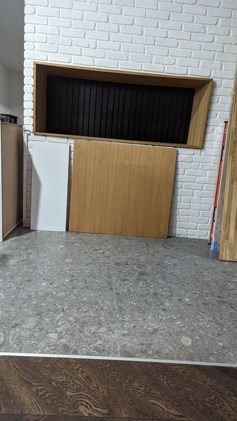
After a year of living with our “starter kitchen,” we realized it wasn’t enough. We needed more storage and also we had to address the elephant in the room, the brick wall, so we expanded the cabinetry.
We love our brick wall it add texture and it hold our entire house and we also grown to love the weird niches inside of it. We know we wanted to to something with it and not cover it all completely but its location is right next to the pathways to the 2nd living room and the island it was necessary to create a custom cabinetry solution.
For the brick wall cabinetry, we used 15-inch deep cabinets instead of 24 inch. That slimmer profile kept the pathways open and airy, while transforming two awkward niches into one big appliance garage that’s now one of the most functional spots in the house.


And that's when we were also ready to make a more permanent decision on our counter top We knew we wanted terrazzo, as it has a mid-century vibe and fit the character of the house perfectly. At first, we dreamed of going bold with color. But we also know Debbie (and her ADHD): too bold and she'd get overwhelmed or tired of it quickly.
So instead, we chose a terrazzo in a subtle scheme of whites and browns. It still has personality and texture, but in a palette we won’t get tired of. We also carried the terrazzo up onto the backsplash. That seamless move tied the whole kitchen together.
It’s durable, timeless, and one of the best decisions we made in this house.
For the island countertop, we replaced the old linoleum with butcher block. Covering an island this size in stone would’ve been incredibly expensive, and we wanted to keep the warmth of oak in the design. Butcher block was the perfect compromise: budget-friendly, natural, and full of character. We love how it ages — food and heat marks add charm, and if they ever bother us, we can just sand and reseal it.
Pairing the butcher block on the island with the terrazzo on the cabinetry gave us a nice contrast: warm and natural in the center, bold and durable around the perimeter.
Phase 3: Storage + Smart Design Choices
As we grew into the space, storage and flow became the next priority.
We replaced the cabinets against this wall between the big window and the sliding door so many times, we started with recycle bin cabinets together with a big open shelf but it wasn't practical. Than, we bought 2 adorable arched cabinets but it didn't provide the storage and practicality we needed. After considering the price for another custom builtin we decided to build a big pantry closet again with Ikea. We used 13-inch deep IKEA Pax closet instead of the 22-inch option. The shallower depth kept the circulation space wide while still packing in lots of storage.
Today: Our Kitchen in Progress


Today, our kitchen feels bright, functional, and truly ours. It’s been built in phases, tweaked, expanded, and redesigned more than once. But that’s the beauty of it: each version taught us something new.
That said, we still have a to-do list:
Cabinet crown trim: We need to trim the tall cabinets and pantry. We're still debating whether to take them all the way to the ceiling or keep the open space. We're not a fan of traditional crown molding, so we're hunting for a more modern solution, maybe even a DIY trim. Matching the oak makes it tricky, so we're waiting until we know what feels right.
Appliance garage: Do we add a door for a cleaner look, or leave it open for convenience? the appliances from Our place are adorable so don't feel a huge need to cover them. Still undecided.
Appliances: We’ve already replaced the dishwasher once, and now the built-in stove needs to be swapped too. When we do, I’m planning to move from stainless steel to slate appliances. They’re much less sensitive to fingerprints and scratches — something our family will definitely appreciate.
Lighting: At first we used long ceiling fixtures, but the placement wasn’t great and they always looked awkward. Once we added the hood, we realized it provided amazing task lighting on its own. To avoid making the ceiling too busy, we switched to spotlights - simple, functional, and bright. Maybe in the future I’ll customize the vent hood cover, but for now this solution works perfectly.
Even with a few unfinished details, this kitchen finally feels like the heart of our home and one that will keep evolving with us.
Lessons Learned Along the Way
That's ok to build in phases. Renovating the entire house is expensive. its totally ok if you don't want to spend $30K on a new kitchen right away or need more time to make the pricy decisions. Function beats perfection at the start. Phasing makes it easier on the budget. Give yourself time to understand your taste, learn from mistakes, and save for the next upgrade.
Live in it first. Real life shows you what you actually need, not what you think you’ll need on paper.
Think about proportions. Cabinet depth, doors vs drawers, counter overhang, paths of travels, and flow can make or break how comfortable a space feels.
Mistakes are part of it. Faucets, counters, paint- all fixable, all part of the journey. Every “wrong” choice teaches you something.
Mix materials. Butcher block on the island and terrazzo oak and white gave us warmth and durability and a look that feels layered even when the color were neutral
It’s never “done.” Every kitchen has an evolving to-do list, and that’s okay. Design is a living process.
Regrets?
Only one. We should've placed the sink under the countertop and not on top of it.
Kitchen Sources box
IKEA Sektion cabinets
Reform- Doors, drawers fronts and Butcher block and sink.
Concrete Collaborative- Terrazzo slabs
Tile bar - Kitchen floor tiles
Amazon- Faucet
IKEA Pax - Pantry solution and doors
Article - Bar stools / lighting, dining chairs and dining table.
Home Depot - Appliances

Comments